Back Shreyo Debnath

Freemium 3.0 → 4.0

Owned the free tier for users who cancelled, from 3.0 through 4.0: what they still see, what is locked, and where the upgrade prompts sit.

Role Product Designer, sole owner (3.0 through 4.0)
Timeline 5 months
Team Design Director · Sr. Designer · PM · APM · Frontend Engineer
Tools Figma
Status Freemium 4.0 closed. Handed to PD. Closed · Jul 2026

At a glance

A free tier that gives enough value to matter and keeps a reason to upgrade.

Problem
Basic users cancelled and pay nothing, but they still open the app. The product had to earn from them or win some back.
My part
Sole owner from 3.0 through 4.0: two new pitches (Rent Reporting and Sub Management), real data in the Credit Tab, and two product decisions I held and documented.
Result
Freemium 4.0 closed in July 2026 and was handed to PD. I have no data yet on whether the real Credit Tab data reduced upgrade conversions.

Context

How do you make money from users who stopped paying you?

At Bright, a "Basic" user is someone who cancelled their subscription. Zero dollars. Gone. But not gone from the app. These users still have it installed, still open it. The question is whether the product can do something with that.

Most of these users have poor credit scores. That means they're the right audience for cash advance offers through Bright's affiliate programme. Every offer taken generates revenue without the user paying Bright directly. The other path: give them just enough value that some of them re-subscribe.

Freemium is the layer that sits on top of the Basic experience. It controls what these users see, what's locked, what's pitched, and what's offered. I owned it from version 3.0 through 4.0.

Before I picked it up

The evolution from 1.0 to 2.0.

Freemium 1.0 Introduction of PLU (in-app offer card) flows and interstitials for Basic users. Cash advance offers through affiliates surfaced first. All tabs locked with upgrade CTAs. The bare structure: show offers, show what you're missing, ask them to pay.
Freemium 2.0 Flow changes. The Credit Tab unlocked for Basic users, but with a dummy score. Users could see enough to understand the value, not enough to use it. Full app access unlocked by paying.
Evolution: Freemium 1.0 to 2.0
Evolution: Freemium 1.0 → 2.0

Solution

What 3.0 added: something specific for churned users to act on.

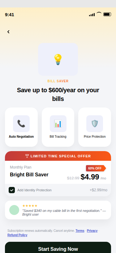
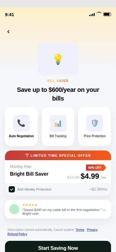
Two new pitches for Basic users: Rent Reporting and Sub Management. Both are standalone value propositions strong enough to generate opt-ins on their own. The idea: don't just tell churned users what they're missing. Give them something specific to act on.

The Credit Tab also changed. Instead of a dummy score, 3.0 showed actual data in the rent screens. Real information, not a preview. Basic users could now see genuine value in one tab, which made the locked tabs harder to ignore.

The design problem: how much do you give away before the upgrade loses its pull? Too little and users leave. Too much and they never pay.

Rent Reporting Pitch
Sub Management Pitch
Credit Tab, Real Data
Locked Tab State
Locked Tab State

Decisions

Holding the line on two product decisions.

1 · Copy ownership on a disclosure modal

Mid-handoff, the APM requested a copy change on the disclosure modal. I pushed back. Disclosure copy is compliance-adjacent. It needs review from the PM who owns product copy, not the APM pushing for a faster ship.

This was uncomfortable. I was pushing back on the same person I needed sign-off from. But the right reviewer is the right reviewer regardless of who's asking. I escalated it to the Design Director. He agreed. The PM reviewed the copy before it went out.

A disclosure modal is not the place to move fast and fix later.

2 · In-app button colour standard

The APM requested green CTAs on the survey screens. The Design Director's stated standard for in-app buttons is black. Engineering flagged that switching to black would cost bandwidth they didn't have.

Two options. Implement green quietly and move on. Or document the decision.

I documented it. In writing, on the channel, CC'd the Design Director. The green implementation shipped as a bandwidth concession. Not a design decision. When Engineering rolls out the black CTA standard across the app, this screen is already on the list.

Shipped Green CTA Engineering bandwidth constraint. Documented as a temporary concession, scheduled to align with the broader in-app black CTA rollout.
Design direction Black CTA Design Director's stated direction. Not implemented due to engineering capacity, not design preference.

The difference between "we shipped green" and "we shipped green because of X, documented on Y, scheduled to change on Z" is the difference between a designer who executes and one who owns.
Takeaways

What I'd do differently.

Shreyo Debnath · Product Designer

shreyoisonline@gmail.com