Jupiter Banking TVC
A two-minute "Slice of Life" television ad for Jupiter Banking, aimed at gen-z. Commercial design and film.
Overview
A two-minute ad that starts with a person, not a product.
Brief
Make a "Slice of Life" television ad that conveys Jupiter's core values and connects with gen-z. We were Jupiter's users, and we believed it needed an ad showing real people solving real problems.
My part
Creative director, director, storyboard artist, copywriter, editor and colorist, with a team of five.
Result
Viewers connected with the characters before the product entered the frame. Faculty said it needed more refinement.
Context
Can neo banking be advertised to feel human?
Delving into the world of financial technology, the team explored neobanks where Jupiter Banking is a key player. The task was to create a "Slice of Life" narration style two-minute television ad by comprehending Jupiter's core values. Using film and video elements like storytelling and visuals, the ad needed to effectively convey Jupiter's message and establish a connection with its target audience: gen-z.
Jupiter Banking is a growing neobank. Since the team were the brand's users and customers, they believed it needed a more engaging advertisement: one that showed real people solving real problems, not a product demo with motion graphics.
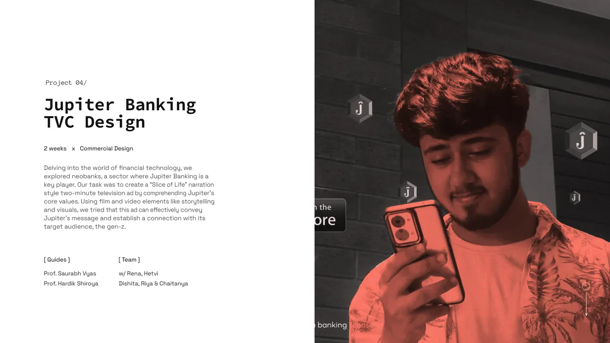
Project overview.
Pre-production
Script, storyboard, scout.
The process began with scripting, storyboarding, and location scouting. The narrative was built around a "Slice of Life" framework: real scenarios where Jupiter's features solve everyday friction around money. The storyboard mapped each scene to a specific product value: splitting bills, tracking spending, instant transfers.
The arc of the story is divided into 3 sequences, with 4 scenes. The motion graphics, shot direction, sound design, editing and storyboarding were my major contribution to the making.
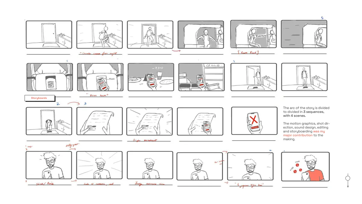
The storyboard: 24 hand-drawn frames across 3 sequences and 4 scenes.
Production
Shot on location, warm and candid.
Directing and cinematography were handled on location. The visual language leaned warm and candid, matching the conversational tone of the script. The goal was to keep the ad feeling like a story first, a product pitch second.
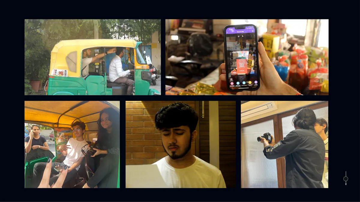
Behind the scenes: the auto-rickshaw, the shop, and the crew at work.
Post-production
The cut, the grade and the motion.
Editing, color grading, and sound design brought the final cut together. DaVinci Resolve handled the color grade. Premiere Pro and After Effects managed the edit and motion elements. The two-minute runtime was treated as a hard constraint, not a suggestion.
Outcome
A two-minute ad that starts with a person, not a product.
The final ad was reviewed by faculty and tested informally with target-audience peers. The "Slice of Life" narration landed: viewers connected with the characters before the product entered the frame.
Takeaways
What this project built.
- Directing as design. A two-minute ad has the same constraint structure as a product flow: every second either earns the next or loses the viewer. Storyboarding is wireframing for time.
- Copywriting for spoken delivery is different from copywriting for screens. Rhythm, breath, and pause matter more than word count.
- Know the gap between concept and finish. The faculty feedback was direct: refinement was needed. The ad communicated the idea but the execution had rough edges in pacing and transition. Seeing that gap is the first step to closing it.