Back Shreyo Debnath

Logofolio & Brand Marks

Four brand identities across healthcare, a college club, a government programme and gaming, drawn between 2019 and 2024.

Role Brand Designer, Visual Identity Designer
Timeline 2019–2024
Type Brand Identity Design
Tools Adobe Illustrator, Photoshop
Status Freelance & Conceptual Work Freelance & Conceptual

At a glance

Understand the audience before drawing a single stroke.

Principle
A mark connects to people first, so each identity in this collection began with its audience.
My part
Brand and visual identity designer on all four marks.
Range
A hospital, a literary club, an IIT programme and an esports startup. Each reset the colour, tone and visual density.

Context

What makes a mark memorable?

"A logo must work as a simple, unobtrusive and didactic use of figuration. It must be as simple a sign as easy to read as a child's picture book." Bob Noorda

A mark must be as immersive as a semiotic symbol which connects to the people first and must holistically align with the ideals and reality of its audience. Each identity in this collection began with that principle: understand the audience before drawing a single stroke.

Brand mark 01

Svasthik Hospital

Conceptual · Healthcare

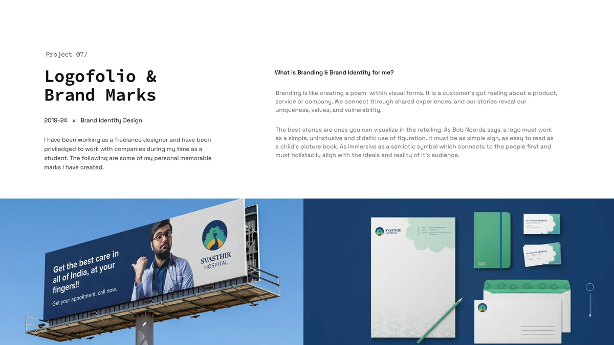
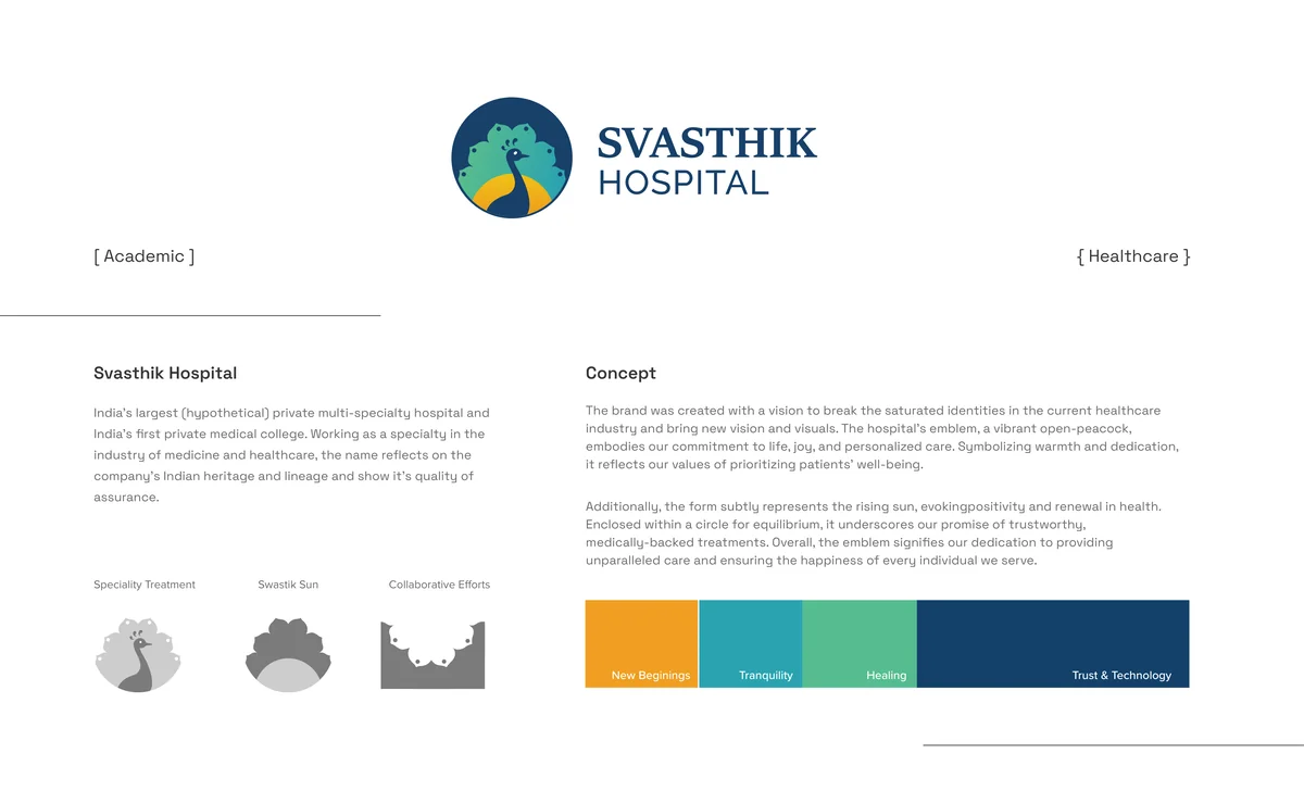
A hypothetical brand: India's largest private multi-specialty hospital and first private medical college. The brand was created with a vision to break the saturated identities in the current healthcare industry and bring new vision and visuals.
Svasthik Hospital: Primary Logo

The hospital's emblem, a vibrant open-peacock, embodies commitment to life, joy, and personalized care. Symbolizing warmth and dedication, it reflects values of prioritizing patients' well-being. Additionally, the form subtly represents the rising sun, evoking positivity and renewal in health. Enclosed within a circle for equilibrium, it underscores the promise of trustworthy, medically-backed treatments.
Peacock Emblem Construction
Color Palette and Typography
Color Palette & Typography
Brand Applications
Brand Applications

Key concepts: Specialty Treatment, Swastik Sun, Collaborative Efforts, New Beginnings, Tranquility, Healing, Trust & Technology.

Brand mark 02

Sigma Voice: The Literary Club

Commercial · College Club

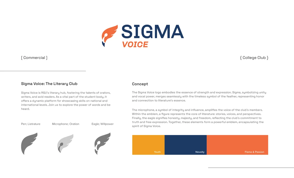
Sigma Voice is RGU's literary hub, fostering the talents of orators, writers, and avid readers. As a vital part of the student body, it offers a dynamic platform for showcasing skills on national and international levels.

Sigma Voice: Primary Logo

The logo embodies strength and expression. Sigma, symbolizing unity and vocal power, merges with the timeless symbol of the feather, representing honor and connection to literature's essence. The microphone, a symbol of integrity and influence, amplifies the voice of the club's members. Within the emblem, a figure represents the core of literature: stories, voices, and perspectives. The eagle signifies honesty, majesty, and freedom.

Emblem Breakdown
Emblem Breakdown
Monochrome Variants
Monochrome Variants
Merchandise Mockups
Merchandise Mockups

Key concepts: Youth, Novelty, Flame & Passion, Pen/Literature, Microphone/Oration, Eagle/Willpower.

Brand mark 03

INUP I2I: IIT Programme

IIT Guwahati Internship · Government

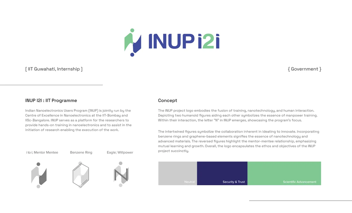
Indian Nanoelectronics Users Program (INUP) is jointly run by the Centre of Excellence in Nanoelectronics at IIT-Bombay and IISc-Bangalore. INUP serves as a platform for researchers to provide hands-on training in nanoelectronics and to assist in the initiation of research.

INUP I2I: Primary Logo

The logo depicts two humanoid figures aiding each other, symbolizing the essence of manpower training. Within their interaction, the letter "N" in INUP emerges, showcasing the program's focus. The intertwined figures symbolize the collaboration inherent in ideating to innovate. Incorporating benzene rings and graphene-based elements signifies the essence of nanotechnology and advanced materials.

Figure and Letter Construction
Figure & Letter Construction
Molecular Grid System
Stationery and Print
Stationery & Print

Brand mark 04

One Shot eSports

Conceptual · Gaming

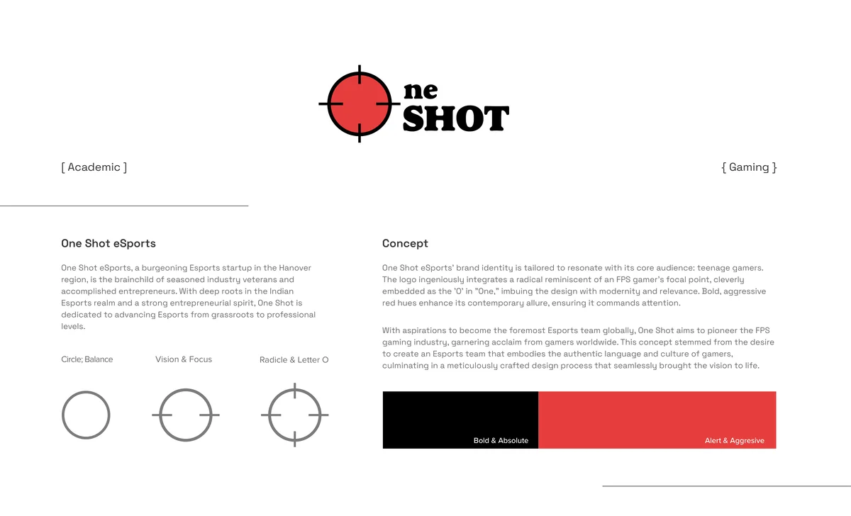
One Shot eSports, a burgeoning Esports startup in the Hanover region, is the brainchild of seasoned industry veterans and accomplished entrepreneurs. With deep roots in the Indian Esports realm and a strong entrepreneurial spirit, One Shot is dedicated to advancing Esports from grassroots to professional levels.

One Shot eSports: Primary Logo

The brand identity is tailored to resonate with teenage gamers. The logo integrates a crosshair reminiscent of an FPS gamer's focal point, cleverly embedded as the "O" in "One," imbuing the design with modernity and relevance. Bold, aggressive red hues enhance its contemporary allure.

Logo and Crosshair Construction
Logo & Crosshair Construction
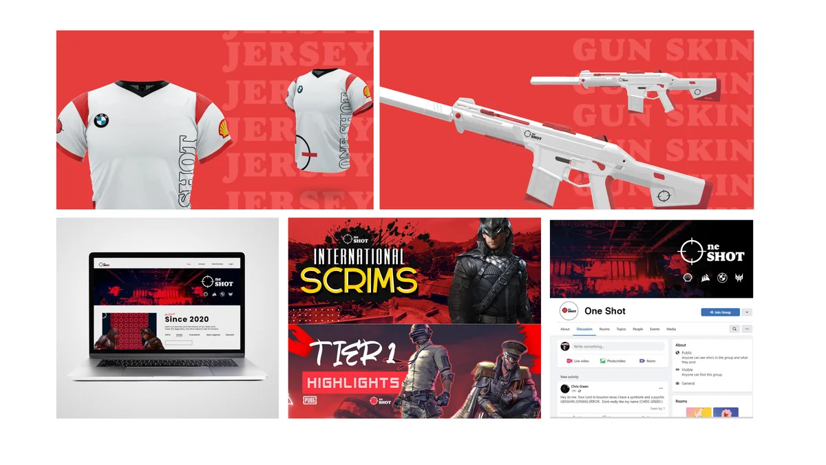
Jersey Design
Jersey Design
Gun Skin Application

Key concepts: Bold & Absolute, Alert & Aggressive, Circle/Balance, Vision & Focus, Radical & Letter O.

Takeaways

What brand identity work has taught me.

Shreyo Debnath · Designer

shreyoisonline@gmail.com