ScribbleShip
A mobile app for ordering stationery and prints on demand in Ahmedabad, taken from sector research to a high-fidelity prototype and a pilot strategy.
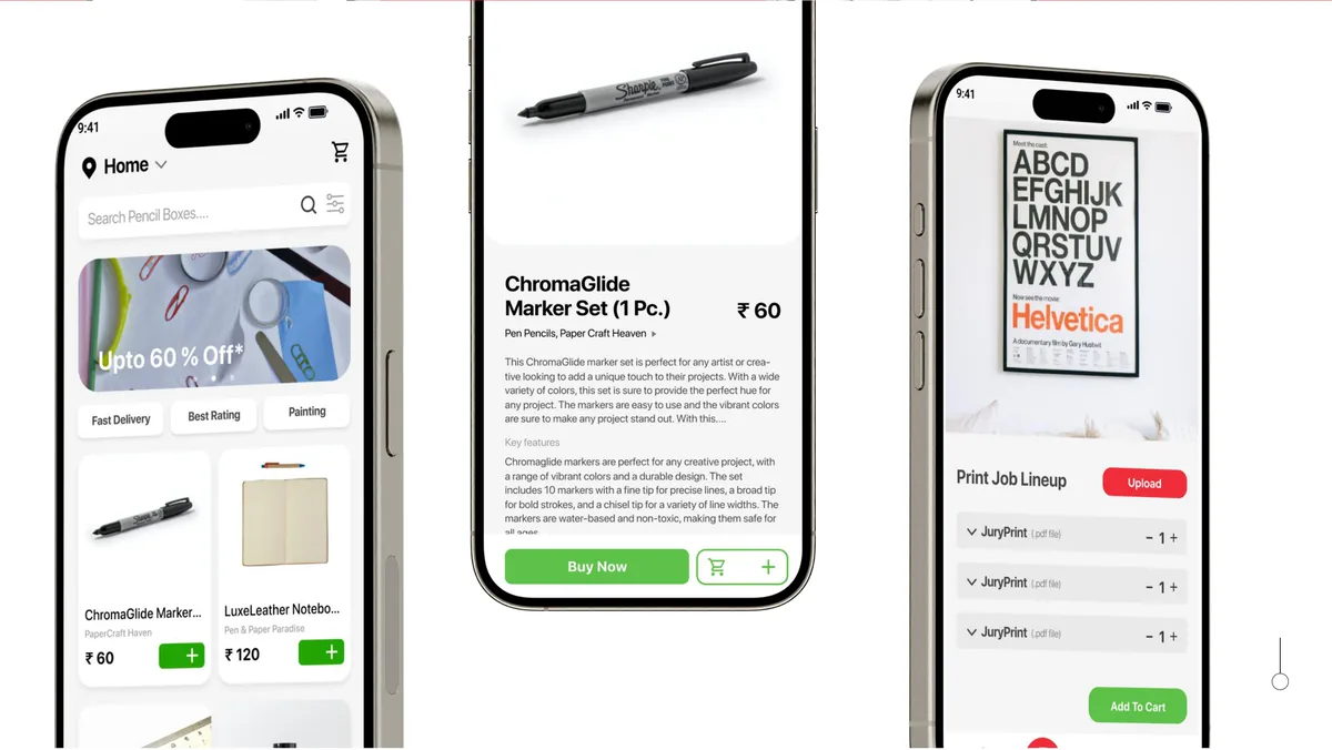
Overview
Ordering stationery as easily as ordering food.
Brief
In Ahmedabad, ordering personalised stationery or prints is fragmented, with no single platform from browsing to ordering to delivery.
My part
I designed the full UI, working from UX research through high-fidelity prototyping. Branding was by Saurabh.
Result
A high-fidelity interactive prototype covering the full user journey, plus a pilot strategy for launch.
Context
Can we deliver stationery and prints on demand?
In Ahmedabad, ordering personalized stationery or print materials is still an inconvenient, fragmented process. Students, businesses, and academic institutions routinely need custom prints, but there is no single platform that brings the entire workflow together, from browsing to ordering to delivery.
ScribbleShip was built to address that gap. It is a mobile app designed to streamline how people discover, customize, and order stationery and print materials. The goal was to make the process feel as effortless as ordering food, bringing personalized stationery and prints on demand to a market that had been underserved.
Design and UX principles were used to devise a comprehensive execution plan, from sector research through to a pilot strategy. I designed the full UI, working from UX research through high-fidelity prototyping.
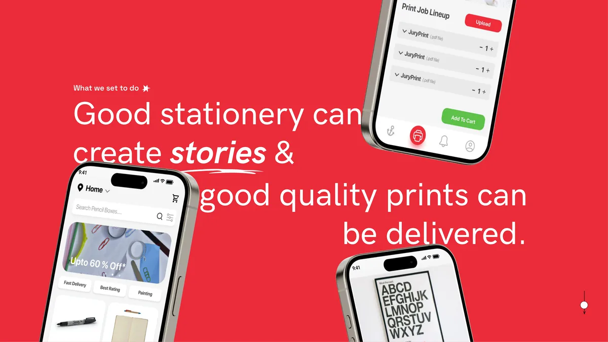
What we set out to do.
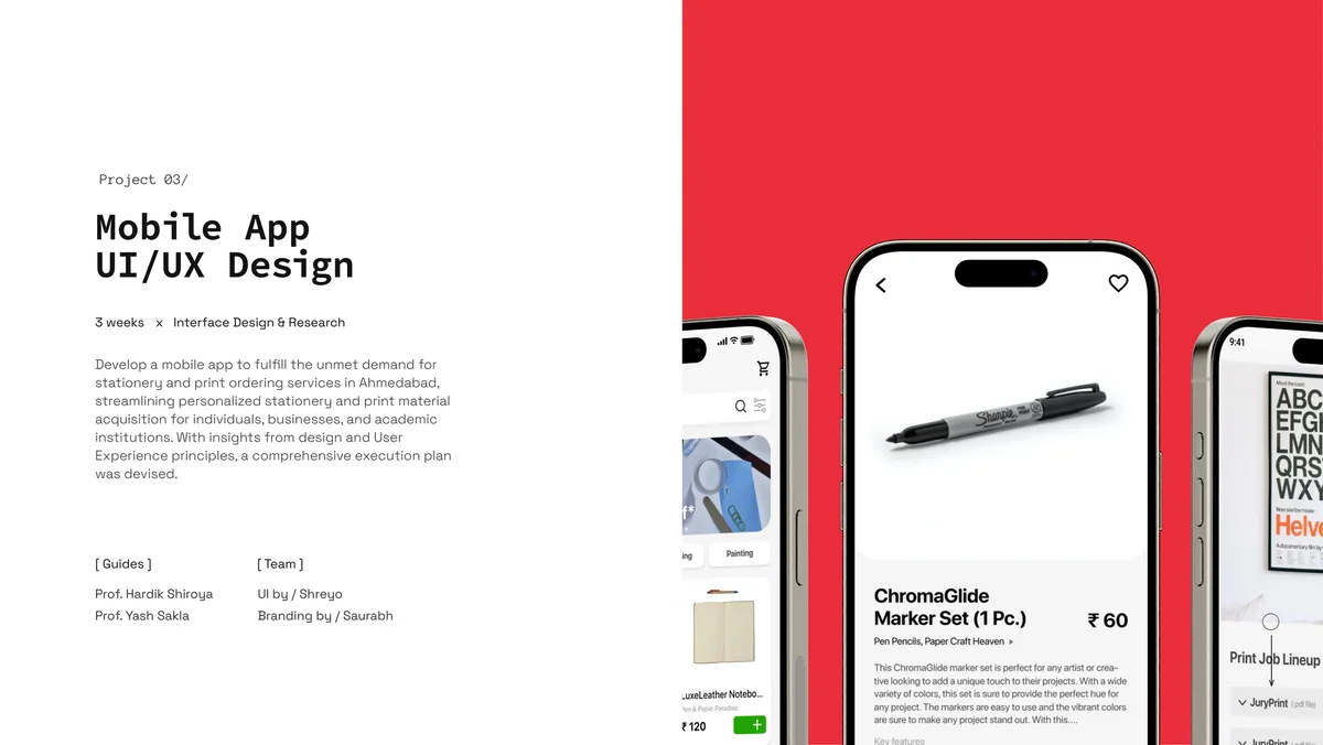
Project overview.
Research
Pick the sector first, then learn who is in it.
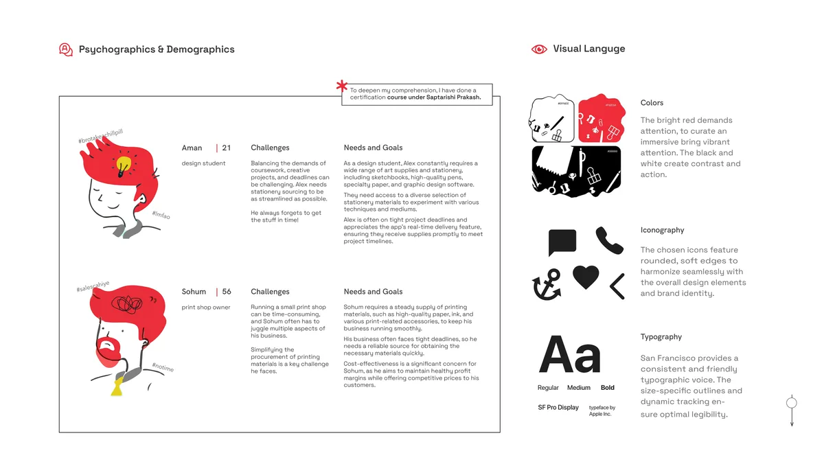
User personas, and the visual language that followed from them.
Wireframes
Test the skeleton before investing in the skin.
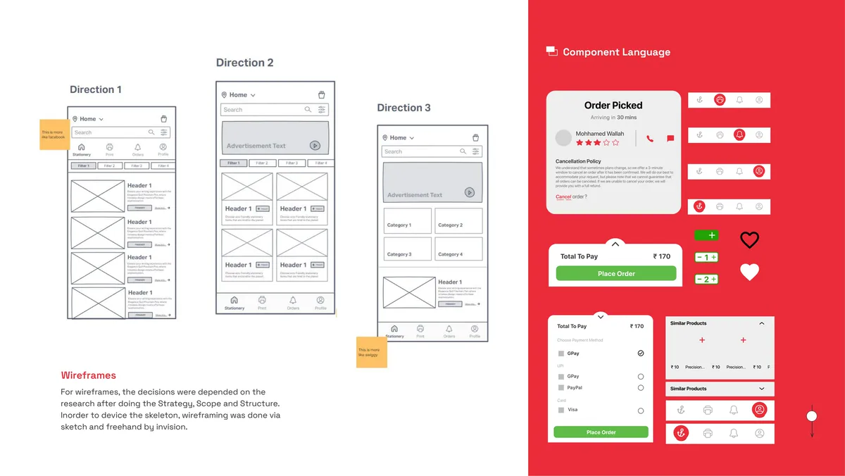
Three wireframe directions, and the component language.
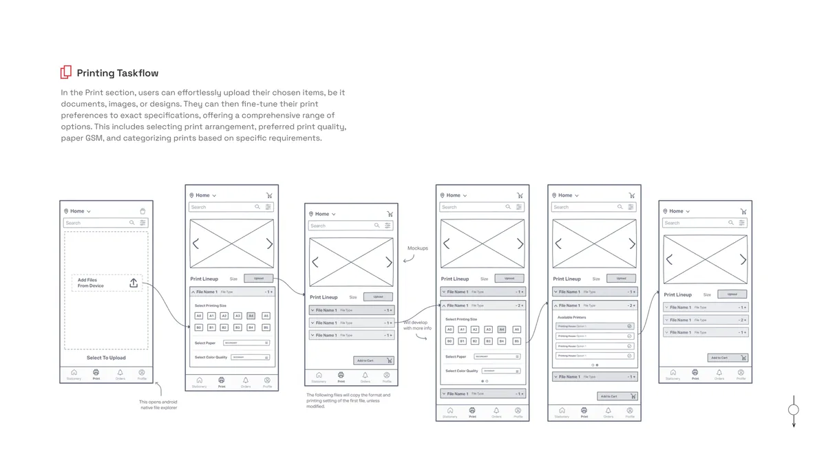
Printing task flow: upload, set print preferences, add to cart.
UI
A visual language that came from the audience.
Usability testing surfaced friction points in the early flows, which were improved before moving to the visual language.
- TypefaceSF Pro Display was chosen as the primary typeface.
- ColourBright red for attention and key actions, with black and white providing contrast.
- IconsRounded and soft, to match the friendly, approachable tone of the brand.
The final high-fidelity prototype covered the full user journey, and a pilot strategy was drafted for launch.
Outcome
A complete mobile experience.
The final deliverable was a high-fidelity interactive prototype covering the full user journey: onboarding, browsing stationery, placing print orders, customizing materials, and tracking delivery. Usability testing validated that the core flows were intuitive and the visual language was well-received by the target audience.
The project also served as an exercise in end-to-end product thinking: from identifying a market opportunity through sector research, to defining a USP, to shipping a tested prototype with a pilot strategy. A certification course under Saptarishi Prakash deepened my comprehension of the design process throughout.
Takeaways
What I took away.
- UX research before UI prototyping is not optional. The sector selection and gap analysis gave the project a foundation that made every downstream decision faster and more grounded.
- Test at the wireframe stage. Usability testing there caught problems that would have been expensive to fix in high fidelity. Testing early is always worth the time.
- The visual language came from the audience. SF Pro, bright red for action, soft rounded icons: design decisions that follow research feel intentional, not decorative.
- Range carried into later work. Working across UX research, UI design, strategic planning, and information architecture in a single project built it.