Bright builds your credit. It does not protect it. So I designed the product that would.
A subscription identity protection product for Bright Money, taken from competitor research through end-to-end high fidelity, a three-tier pricing model and a go-to-market plan, then pitched to the executive team. Designed, priced and argued by design.
A credit app that watches your score go up and nothing else.
Bright's whole promise is credit. Users hand over their financial life so the app can help them build a score. What the app did not do was tell them when someone else was using that identity. Missed payments and utilisation wreck more scores than fraud does, but they are the user's own to fix; an account opened in your name is the one failure mode the app watched you walk into and said nothing about.
Competitors had already worked this out. Aura and LifeLock sell identity protection as a subscription; Credit Karma, Experian, Albert, MoneyLion and Brigit all had some version of it. Bright had the data, the daily engagement and the credit relationship, and no product.
The gap analysis fitted in one line: Bright builds credit but does not protect it.
Three features, because a fourth would have been noise.
The MVP came down to Smart Alerts, Guided Action and a Status View. Tell the user something changed, tell them exactly what to do about it, and give them somewhere calm to check that nothing is on fire. Everything else on the competitor feature matrix was a second-release problem.
The interesting constraint was not visual, it was operational. How often you pull credit is simultaneously a cost line, a latency budget and a product promise. Once a day and four times a day are different products at different prices, so I went and got both options costed before drawing the alert states that depended on them.
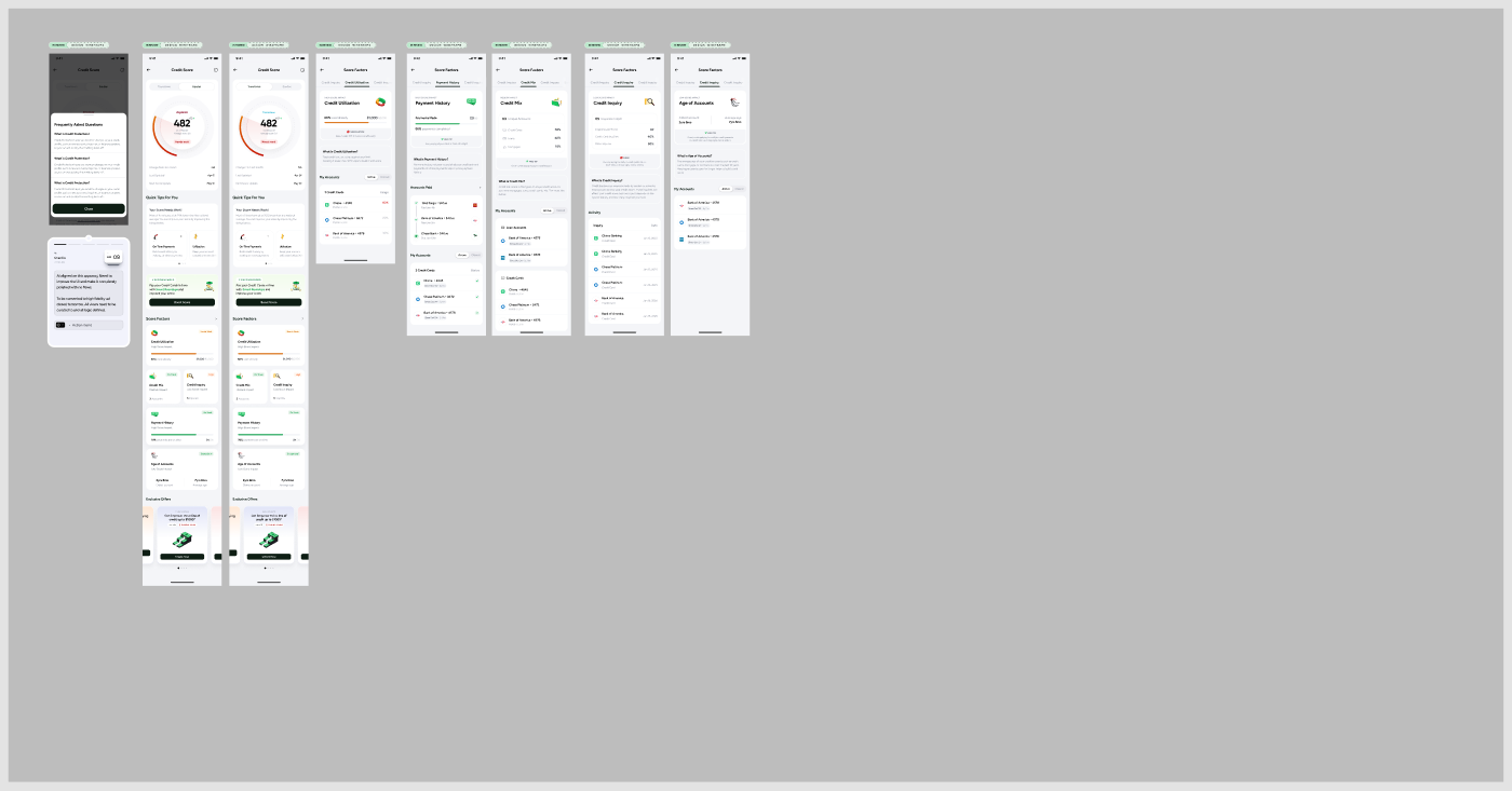
Alert fatigue. A protection product that cries wolf gets muted, and a muted protection product is worse than none.
Every alert carries a next action. If we cannot say what to do about it, it is a status change, not an alert.
User anxiety. Selling protection means telling people they are in danger, which is a short walk from scaring them off the app.
A calm resting state that says nothing is wrong, so the product is mostly reassurance and occasionally an alarm.
A status view you glance at, and a dispute centre you use once.
Everything resolves to two screens, designed against opposite rules. The status view has to be boring on almost every visit. The dispute flow exists for the one day something is actually wrong, and on that day it has to carry someone through a process with a legal shape to it.
The status view is a single scroll, and it is modular because it had to survive being reordered by whoever owned the home screen that quarter. No block is allowed to depend on the block above it.
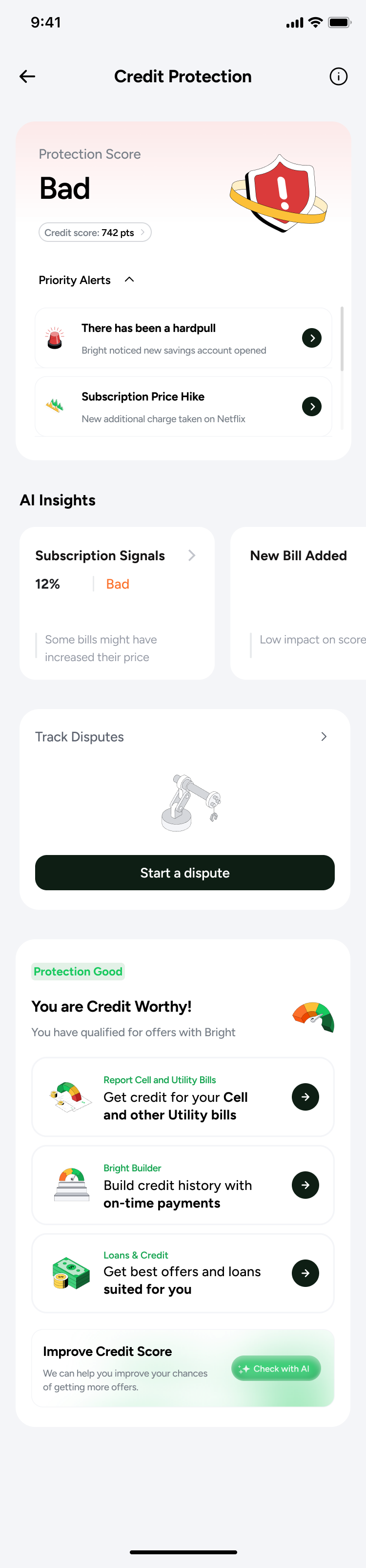
Score, alerts, insights, dispute entry, then the cross-sell Bright already ran. Alerts collapse; every module below them reorders without breaking.
It carries a fault I did not fix. The hero reads Protection Score: Bad, and two thirds down the same scroll a second module says You are Credit Worthy. Both are true — one judges exposure, the other lending eligibility — but they are two verdicts on the same person in one column. Resolving it needed the score logic underneath, and that was still an open item when the file closed.
The dispute centre is the part I would defend hardest. Every alert has to end somewhere, and the somewhere is a filing with a credit bureau. So disputes are tracked in states rather than fired and forgotten, the action button names the bureau it writes to rather than saying Submit, and an explainer sits in front of the form — a dispute is a quasi-legal act, and people abandon those halfway when they cannot tell what they are signing up for.
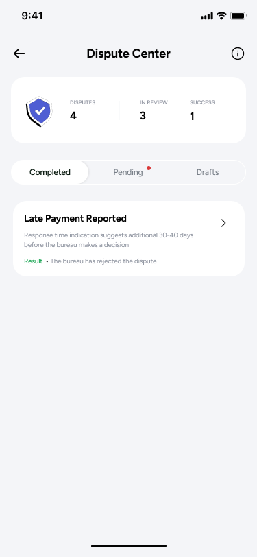
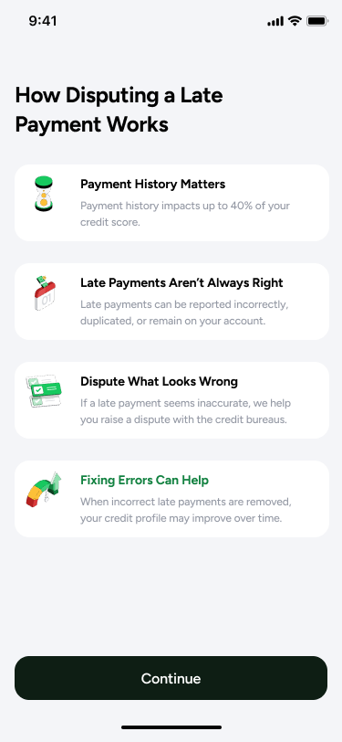
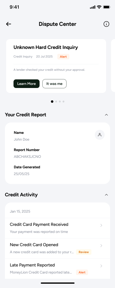
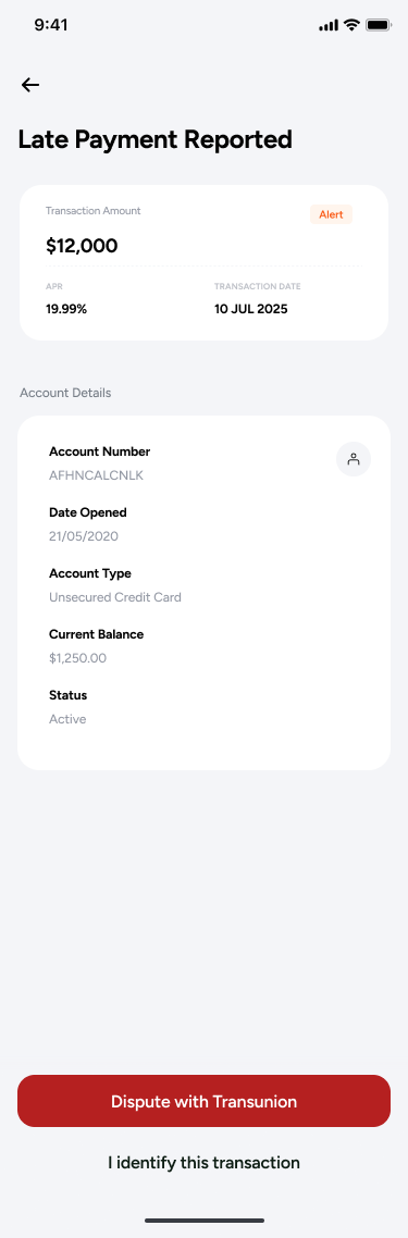
The secondary option on the last screen matters more than the primary one. I identify this transaction lets someone close an alert without filing anything. A protection product that only offers escalation teaches people to ignore it.
I was asked to make it more panic worthy.
The acquisition screen went through three generations, and lined up they are a clean record of an argument I partly lost. The phrase in the heading is not mine — it is what came back from the review of the first version.
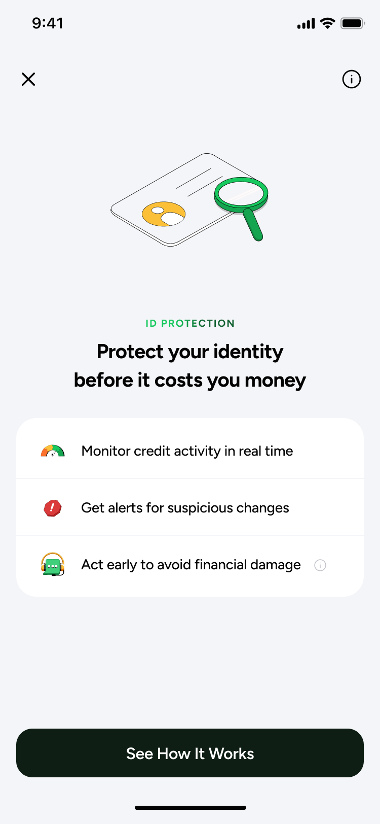
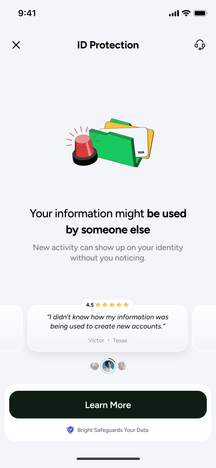
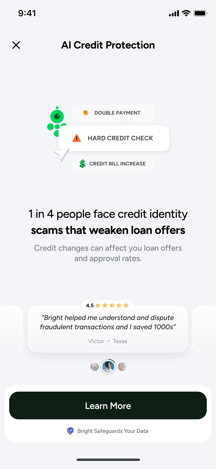
Benefit, then threat, then statistic. V1 asks you to See How It Works. V2 replaces the benefit with a threat and adds social proof. V3 opens with a number, floats three warning chips above the fold, and quantifies the testimonial. The product picked up the word AI somewhere between the second and third.
This contradicts what I argued two sections earlier. I said the design response to user anxiety was a calm resting state, then drew a fear-led acquisition screen. Both are in the same file.
I do not think the escalation was wrong — a protection product nobody enables protects nobody, and v1 was so polite it never said what was at stake. But it went to executives as a judgement call rather than a tested one, so I cannot tell you whether the statistic converted better than the benefit did. On a product that shipped I would have argued to run the calm version against the loud one first.
The onboarding underneath stayed in the calmer register throughout. Sell with urgency, explain without it.
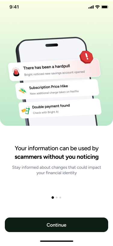
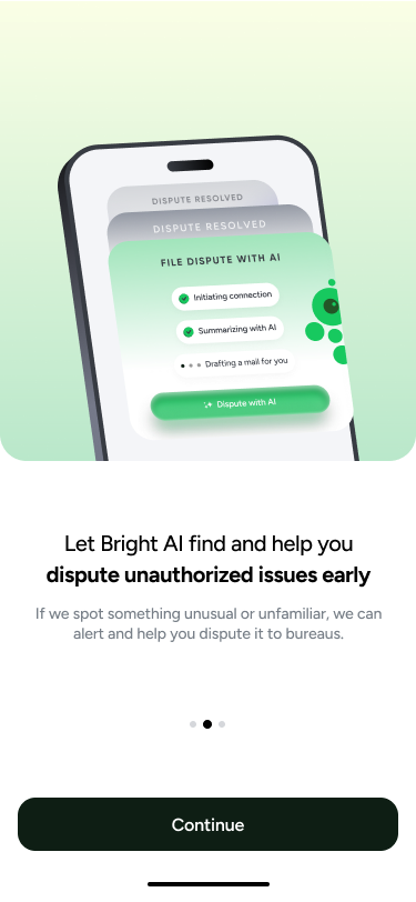
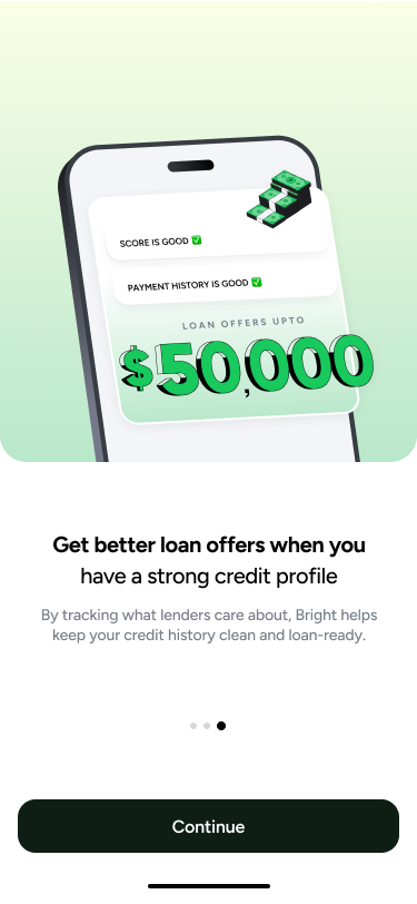
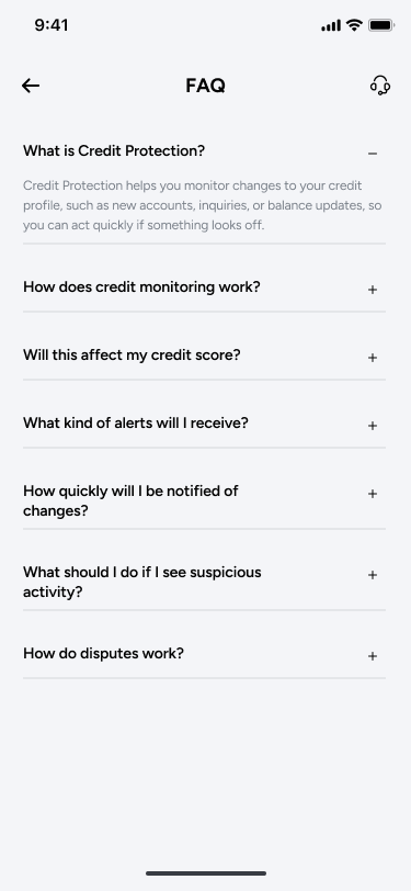
Three steps and an FAQ. Threat, response, reward — then the questions answered on the screen rather than in a help centre, which is the same pattern the score views use. This is the register I would have wanted the sell screen to meet in the middle.
Three tiers, benchmarked, with a route to market attached.
A feature proposal without a price is a wish. So the deck carried a worked pricing model: three tiers at twelve, eighteen and twenty-five dollars a month, each with a first-year discount, benchmarked line by line against Aura, LifeLock and Experian IdentityWorks rather than picked to feel reasonable.
Go to market was two-phase on purpose: bundle it into Bright Pro free for three months to measure real engagement, then sell it standalone from month four once there is evidence it gets used. Acquisition inside an app people already open costs nearly nothing, against the thirty to a hundred dollars a head the deck attributed to standalone competitors — but that advantage only pays off if the thing is good enough to keep.
A three-year revenue model and an exit-multiple scenario sat behind the pricing. Those figures are Bright's, and I have left them off this page.
The most useful thing I built, I deliberately did not send.
In January I put together a full business plan and showed it to a design peer before sending it to the business owner who would carry it forward. His advice was to hold it back, so the owner would arrive at the strategy himself rather than be handed it. I sat on it.
That was the right call, and it cost me nothing except the satisfaction of being seen to have done the work. A business case somebody owns beats a better business case somebody was given.
Design finished. The product did not ship.
End-to-end high fidelity closed on 2 February. After that the project moved at the speed of the business owner's calendar, and his calendar was owned by a much larger release. I stopped design work rather than keep polishing something with nobody to receive it. It came back twice — a UX pitch in March, a full pricing proposal in April — and as of the last record I have, it has not launched.
The brief was a feature. What was missing was an argument: who buys this, at what price, against whom, and why us. Building that turned out to be within reach of a designer, which I had not assumed going in. The proposal never came back asking for a price.
A designer taking a revenue idea from research to a priced, benchmarked, exec-facing proposal is the work, and it does not stop being the work because someone else's roadmap was full.
What is still missing, and why. Bright's revenue projections stay inside Bright, so section 05 describes the pricing method without the figures. The screens are design files rather than shipped product — the numbers in them are placeholder data, and the review notes are paraphrased. The real gap is evidence: nothing here was put in front of a user, so every claim about how it would behave is an argument from craft rather than a result. Happy to walk the working file live, get in touch.